
Custom Vue Forms
How nrg renders the editor form from your schema, and how to replace or extend it with a custom Vue component using useFormNode and the built-in form components. For the schema-driven field catalog, see The Editor Form.
The editor form
NRG generates the node's edit dialog from your schema — you don't write any HTML or jQuery. Your config fields render first (with name always at the top), followed by two framework-managed sections:
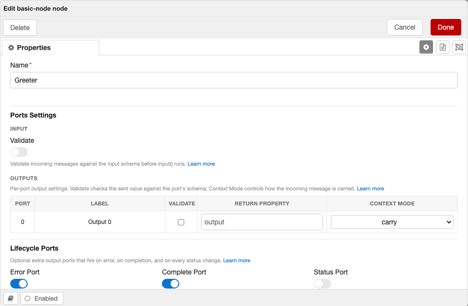
- Ports Settings — rendered on every IONode (config nodes never get it). Its subsections:
Outputs — a per-port table, one row per base output port. The rows come from the node's types (its port topology); the columns are Label, Validate Data, Data Schema, and Description (the port's description from the label catalog):
- Validate Data (+ Data Schema) — renders on every node with output ports; the framework injects
outputSchemasinto every IONode. Toggle it on for a port to check the sent value against that port's schema.
The table tracks the node's live output count, so dynamic-output nodes grow and shrink the rows automatically (lifecycle ports excluded).
- Validate Data (+ Data Schema) — renders on every node with output ports; the framework injects
Lifecycle Output Ports — Error, Complete, and Status toggles, on every node (off by default). Enabling one adds that output port. See lifecycle output ports.
Input — a single-row table mirroring the Outputs columns (Label, Validate Data, Data Schema, Description), rendered on every node with an input port; the framework injects
inputSchemainto every IONode. Toggle Validate Data on to validate incoming messages against a schema.
Each help line links to the relevant docs.
What's always there
Two different mechanisms are at play:
- Ports come from your types. Your node's
InputandOutputs/Porttypes draw the ports on the canvas and the rows in the Outputs table. - The framework injects its config fields into every IONode. The build spreads
name, the three lifecycle-port toggles (errorPort,completePort,statusPort), and the data-validation fields (inputSchema,outputSchemas, and theirvalidateInput/validateOutputstoggles) into every node's config schema — so those controls render on every node whether or not you declared them. Declaring one only changes its default.
So a types-first node like a SOQL query — one output port from its Output type, no runtime validation schemas, no declared port config — still shows the full Ports Settings section: the lifecycle toggles and the data-validation controls. The data-validation controls are always there too: a Validate Data toggle (and schema editor) on every node with output ports — gated by the injected validateOutputs flag and populated from outputSchemas — and the Input subsection on every node with an input port, gated by the injected validateInput flag and populated from inputSchema. Config nodes get none of this.
Client-Side Files
NRG auto-generates everything needed for the Node-RED editor from your schema. You don't need to write any client-side code for a basic node. The files below are all optional and exist for when you need more control.
Zero client code required
If your node has a configSchema and credentialsSchema, NRG automatically generates a form using <NodeRedJsonSchemaForm>, wires up defaults and credential fields, and registers the node in the editor. You only need client files when you want to customize behavior beyond what the schema provides.
To add per-field help in the generated form, give the field a description in the label file. Each config and credential field entry is a { label, description } object — label is the field's display label (falling back to the schema title, then the property key, when unset) and description is the per-locale help note rendered as a muted note beneath the input (above its validation error). This is the supported way to document a generated field — set it per locale in the labels JSON:
{
  "label": "My Node",
  "configs": {
    "threshold": {
      "label": "Threshold",
      "description": "Rows above this value are forwarded."
    }
  }
}
src/client/index.ts — Custom Registration
Use this when you need to control the order nodes are registered, fetch data before registration, or run initialization logic:
import { registerTypes } from "@bonsae/nrg/client";
import myNode from "./nodes/my-node";

// e.g., fetch configuration before registering
const config = await fetch("/api/config").then((r) => r.json());

await registerTypes([myNode]);
Client-Side Type Inference
The client package uses your node's TypeBox schemas to provide full type safety in form components. Schema types resolve to their editor form representation:
| Schema Type | Server Infer | Client (form) |
|---|---|---|
SchemaType.String() | string | string |
SchemaType.Number() | number | number |
SchemaType.Boolean() | boolean | boolean |
SchemaType.ConfigNode<T>("type") | Config node instance (T) | string (node ID) |
SchemaType.TypedInput<T>() | TypedInput<T> (with .resolve()) | { value: string; type: string } |
For a numeric field, the generated form also forwards the schema's minimum, maximum, and multipleOf to the <input> as min, max, and step (an integer schema steps by 1) — so out-of-range and decimal values read as invalid for free.
useFormNode (recommended)
The useFormNode composable gives your form component typed access to the node, schema, and validation errors — no defineProps needed:
<script setup lang="ts">
import { useFormNode } from "@bonsae/nrg/client";
import type { ConfigsSchema, CredentialsSchema } from "@/schemas/my-node";

const { node, errors } = useFormNode<typeof ConfigsSchema, typeof CredentialsSchema>();

node.name      // string — typed from ConfigsSchema
node.threshold // number
node.credentials.apiKey // string — typed from CredentialsSchema
node.id        // string — NodeRedNode base property
errors         // Record<string, string> — reactive AJV validation errors
</script>

<template>
  <NodeRedInput v-model="node.name" label="Name" :error="errors['node.name']" />
  <NodeRedInput v-model="node.threshold" label="Threshold" type="number" />
</template>
Both type parameters are optional — omit them to get untyped access:
// Only type config, credentials stays as Record<string, any>
const { node } = useFormNode<typeof ConfigsSchema>();

// No schema typing at all
const { node } = useFormNode();
Infer type utility
For standalone type inference without the form context, use Infer:
import type { Infer } from "@bonsae/nrg/client";
import type { ConfigsSchema } from "@/schemas/my-node";

type Config = Infer<typeof ConfigsSchema>;
// { name: string; prefix: string; threshold: number; enabled: boolean }
// ConfigNode fields → string, TypedInput fields → { value, type }
src/client/nodes/{type}.ts — Client Node Definition
Use this to set editor-only properties that can't be defined on the server — such as button, onPaletteAdd, onPaletteRemove, onEditResize, custom label functions, or to specify a custom form component:
import { defineNode } from "@bonsae/nrg/client";
import MyNodeForm from "../components/my-node.vue";

export default defineNode({
  type: "my-node",
  button: {
    toggle: "enabled",
    onClick() {
      // toggle node state
    },
    enabled() {
      return true;
    },
  },
  onPaletteAdd() {
    console.log("my-node added to palette");
  },
  onPaletteRemove() {
    console.log("my-node removed from palette");
  },
  form: {
    component: MyNodeForm,
  },
});
src/client/components/{type}.vue — Custom Form Component
Use this to replace the auto-generated JSON schema form with a fully custom Vue 3 component. NRG matches components to node types by filename — a file named my-node.vue replaces the auto-generated form for the node with type: "my-node". This gives you complete control over the editor UI:
<script setup lang="ts">
import { useFormNode } from "@bonsae/nrg/client";
import type { ConfigsSchema, CredentialsSchema } from "@/schemas/my-node";

const { node } = useFormNode<typeof ConfigsSchema, typeof CredentialsSchema>();
</script>

<template>
  <NodeRedInput v-model="node.name" label="Name" />
  <NodeRedInput v-model="node.prefix" label="Prefix" />
  <NodeRedInput v-model="node.threshold" label="Threshold" type="number" />
</template>
The useFormNode composable uses your node's TypeBox schemas to give you full autocomplete and type safety on node properties. See Client-Side Type Inference for details.
Full example — conditional visibility, icons, and custom validation
This example shows an HTTP request form that conditionally shows/hides fields and validates them based on user selections — things the auto-generated form can't do on its own:
<script setup lang="ts">
import { computed } from "vue";
import { useFormNode } from "@bonsae/nrg/client";
import type { ConfigsSchema, CredentialsSchema } from "@/schemas/http-request";

const { node, errors } = useFormNode<typeof ConfigsSchema, typeof CredentialsSchema>();

const methods = [
  { value: "GET", label: "GET" },
  { value: "POST", label: "POST" },
  { value: "PUT", label: "PUT" },
  { value: "PATCH", label: "PATCH" },
  { value: "DELETE", label: "DELETE" },
];

const authTypes = [
  { value: "none", label: "None" },
  { value: "basic", label: "Basic" },
  { value: "bearer", label: "Bearer Token" },
];

const hasBody = computed(() => ["POST", "PUT", "PATCH"].includes(node.method));

const validationErrors = computed(() => {
  const result: Record<string, string> = {};
  if (!node.url) result.url = "URL is required";
  if (hasBody.value && !node.body) {
    result.body = `Body is required for ${node.method} requests`;
  }
  if (node.authType === "basic") {
    if (!node.username) result.username = "Username is required";
    if (!node.password) result.password = "Password is required";
  }
  if (node.authType === "bearer" && !node.token) {
    result.token = "Token is required";
  }
  if (node.retries > 0 && !node.retryDelay) {
    result.retryDelay = "Retry delay is required when retries > 0";
  }
  return result;
});
</script>

<template>
  <div>
    <div class="form-row">
      <NodeRedInput
        v-model="node.name"
        label="Name"
        icon="tag"
        :error="errors['node.name']"
      />
    </div>

    <div class="form-row">
      <NodeRedSelectInput
        v-model="node.method"
        label="Method"
        icon="random"
        :options="methods"
      />
    </div>

    <div class="form-row">
      <NodeRedInput
        v-model="node.url"
        label="URL"
        icon="globe"
        :required="true"
        :error="validationErrors.url"
      />
    </div>

    <!-- Only shown for POST/PUT/PATCH -->
    <div v-if="hasBody" class="form-row">
      <NodeRedEditorInput
        v-model="node.body"
        label="Body"
        icon="code"
        :required="true"
        language="json"
        :error="validationErrors.body"
      />
    </div>

    <div class="form-row">
      <NodeRedSelectInput
        v-model="node.authType"
        label="Auth Type"
        icon="lock"
        :options="authTypes"
      />
    </div>

    <!-- Only shown for basic auth -->
    <div v-if="node.authType === 'basic'" class="form-row">
      <NodeRedInput
        v-model="node.username"
        label="Username"
        icon="user"
        :required="true"
        :error="validationErrors.username"
      />
    </div>

    <div v-if="node.authType === 'basic'" class="form-row">
      <NodeRedInput
        v-model="node.password"
        label="Password"
        icon="key"
        type="password"
        :required="true"
        :error="validationErrors.password"
      />
    </div>

    <!-- Only shown for bearer auth -->
    <div v-if="node.authType === 'bearer'" class="form-row">
      <NodeRedInput
        v-model="node.token"
        label="Token"
        icon="key"
        type="password"
        :required="true"
        :error="validationErrors.token"
      />
    </div>

    <div class="form-row">
      <NodeRedInput
        v-model="node.retries"
        label="Retries"
        icon="repeat"
        type="number"
      />
    </div>

    <!-- Only shown when retries > 0 -->
    <div v-if="node.retries > 0" class="form-row">
      <NodeRedInput
        v-model="node.retryDelay"
        label="Retry Delay (ms)"
        icon="hourglass"
        type="number"
        :required="true"
        :error="validationErrors.retryDelay"
      />
    </div>
  </div>
</template>
This form demonstrates:
- Conditional visibility — body editor only appears for POST/PUT/PATCH, auth fields appear based on auth type, retry delay only shows when retries > 0
- Custom validation — computed
validationErrorswith context-aware messages, evaluated reactively as the user types - Icons and labels — every field uses the
iconprop for Font Awesome icons - Schema + custom errors together —
errorsfrom AJV schema validation viauseFormNode()andvalidationErrorsfrom custom logic can be used side by side
Built-in Form Components
NRG registers these components globally in every form:
| Component | Description |
|---|---|
<NodeRedInputLabel> | Reusable label with optional Font Awesome icon and required indicator |
<NodeRedInput> | Standard text/number input bound to a node property |
<NodeRedTypedInput> | Node-RED TypedInput widget (value + type selector) |
<NodeRedConfigInput> | Dropdown to select a config node |
<NodeRedSelectInput> | Dropdown select input |
<NodeRedEditorInput> | Code editor (ACE/Monaco) input |
<NodeRedToggle> | Toggle switch for boolean fields |
<NodeRedJsonSchemaForm> | Auto-generated form from a JSON schema |
<NodeRedTray> | Reusable Node-RED tray (slide-out panel) you drive from Vue — for building custom editors |
Label slot
Every input component (<NodeRedInput>, <NodeRedTypedInput>, etc.) accepts label, icon, required, and help props (help renders a muted note under the input, above the error). You can also override the label entirely using the label slot for full customization:
<NodeRedInput v-model="node.name">
  <template #label>
    <NodeRedInputLabel label="Custom Label" icon="star" />
  </template>
</NodeRedInput>
Building a custom tray with <NodeRedTray>
<NodeRedTray> opens a real Node-RED slide-out tray whose body is a Vue subtree you control — no jQuery. It is the same primitive NRG's own code-editor field is built on, and it is registered globally, so you can use it in any form component. Put your UI in the default slot and open it from a ref:
<script setup lang="ts">
import { ref } from "vue";

const tray = ref<{ open(): void } | null>(null);
function save() {
  // persist the tray's draft state back onto the node
}
</script>

<template>
  <button type="button" @click="tray?.open()">Open editor…</button>

  <NodeRedTray ref="tray" title="My editor" @done="save">
    <template #default="{ close }">
      <!-- your content renders inside the tray body -->
      <div class="my-editor">…</div>
      <button type="button" @click="close">Close</button>
    </template>
  </NodeRedTray>
</template>| Props | title (header text), width (a pixel number, a CSS width, or "Infinity" for full width — the default) |
| Slot | default — rendered into the tray body; receives a { close } helper |
| Events | open / close (tray shown/hidden), done / cancel (footer buttons; both also close the tray) |
Methods (via ref) | open(), close() |
The tray shell (title bar and the Cancel/Done footer) is owned by Node-RED; your slot fills the body.
TypedInput Example
<template>
  <NodeRedTypedInput
    v-model="node.target"
    label="Target"
    :types="['msg', 'flow', 'global', 'str', 'num']"
  />
</template>
Config Node Select Example
<template>
  <NodeRedConfigInput
    v-model="node.server"
    label="Server"
    type="remote-server"
    :node="node"
    prop-name="server"
  />
</template>
i18n in Forms
Use the global $i18n helper to access Node-RED's translation system:
<template>
  <NodeRedInput v-model="node.name" :label="$i18n('label.name')" />
</template>