Creating a Node
This guide walks through creating a complete Node-RED node — from schema definition to server logic to the Vue 3 editor form.
Define a Schema
Schemas define the shape of your node's configuration. They're used for runtime validation and to auto-generate editor defaults.
Create src/server/schemas/my-node.ts:
import { defineSchema, SchemaType } from "@bonsae/nrg/server";

export const ConfigsSchema = defineSchema(
  {
    name: SchemaType.String({ default: "" }),
    prefix: SchemaType.String({ default: "hello" }),
    threshold: SchemaType.Number({ default: 10 }),
    enabled: SchemaType.Boolean({ default: true }),
  },
  { $id: "my-node:configs" }
);

export const CredentialsSchema = defineSchema(
  {
    apiKey: SchemaType.String({ default: "" }),
    secret: SchemaType.String({ default: "", format: "password" }),
  },
  { $id: "my-node:credentials" }
);

export const SettingsSchema = defineSchema(
  {
    apiEndpoint: SchemaType.String({ default: "https://api.example.com" }),
    maxRetries: SchemaType.Number({ default: 3 }),
  },
  { $id: "my-node:settings" }
);
Schema Types
SchemaType extends TypeBox's Type with Node-RED-specific types. The auto-generated form (<NodeRedJsonSchemaForm>) renders each schema type as a specific input widget:
| Schema | Renders As |
|---|---|
SchemaType.String() | Text input |
SchemaType.String({ format: "password" }) | Password input |
SchemaType.String({ "x-nrg-form": { editorLanguage: "..." } }) | Code editor with syntax highlighting |
SchemaType.Number() | Number input |
SchemaType.Boolean() | Checkbox |
SchemaType.Optional(...) | Marks a property as optional |
SchemaType.Array(SchemaType.String()) | Textarea (one entry per line) |
SchemaType.Array(SchemaType.String({ enum: [...] })) | Multi-select dropdown |
SchemaType.Union([SchemaType.Literal(...)]) | Single-select dropdown |
SchemaType.Object(...) | Text input (stored as JSON) |
SchemaType.TypedInput<T>() | Node-RED TypedInput (value + type pair, resolves to T) |
SchemaType.NodeRef(NodeClass) | Config node selector dropdown |
Customizing Form Rendering with x-nrg-form
The x-nrg-form property is a JSON Schema extension that controls how a field is rendered in the auto-generated editor form. You can pass it as an option to any SchemaType method:
SchemaType.String({
  default: "",
  "x-nrg-form": {
    icon: "globe",
    editorLanguage: "json",
  },
})| Property | Type | Description |
|---|---|---|
icon | string | Font Awesome icon name displayed in the field label (e.g., "globe", "key", "server"). The fa- prefix is optional — "globe" and "fa-globe" both work. |
editorLanguage | string | Renders the field as a code editor with syntax highlighting. Supports json, javascript, html, css, yaml, sql, python, markdown, and many more. |
typedInputTypes | string[] | Restricts the allowed types in a TypedInput widget. Defaults to all types: msg, flow, global, str, num, bool, json, bin, re, jsonata, date, env, node, cred. |
toggle | boolean | Renders a boolean field as a toggle switch instead of a checkbox. Only applies to SchemaType.Boolean() fields. |
TypeScript autocomplete is available for all x-nrg-form properties — no imports needed.
Example — adding icons to labels:
export const ConfigsSchema = defineSchema(
  {
    name: SchemaType.String({ default: "", "x-nrg-form": { icon: "tag" } }),
    url: SchemaType.String({ default: "", "x-nrg-form": { icon: "globe" } }),
    timeout: SchemaType.Number({ default: 5000, "x-nrg-form": { icon: "clock-o" } }),
    enabled: SchemaType.Boolean({ default: true, "x-nrg-form": { icon: "check", toggle: true } }),
    server: SchemaType.NodeRef(RemoteServer, { "x-nrg-form": { icon: "server" } }),
    endpoint: SchemaType.TypedInput({
      "x-nrg-form": { icon: "plug", typedInputTypes: ["str", "msg", "flow"] },
    }),
    template: SchemaType.String({
      default: "",
      "x-nrg-form": { icon: "code", editorLanguage: "html" },
    }),
  },
  { $id: "my-node:configs" }
);
Label slot
When building a custom form, all input components (<NodeRedInput>, <NodeRedTypedInput>, etc.) accept label, icon, and required props. You can also override the label entirely using the label slot for full customization:
<NodeRedInput v-model="node.name">
  <template #label>
    <NodeRedInputLabel label="Custom Label" icon="star" />
  </template>
</NodeRedInput>
Text Input
A plain string renders as a text input:
export const ConfigsSchema = defineSchema(
  {
    name: SchemaType.String({ default: "" }),
  },
  { $id: "my-node:configs" }
);
Password Input
Use format: "password" to mask the input:
export const ConfigsSchema = defineSchema(
  {
    secret: SchemaType.String({ default: "", format: "password" }),
  },
  { $id: "my-node:configs" }
);
Number Input
export const ConfigsSchema = defineSchema(
  {
    retries: SchemaType.Number({ default: 3 }),
  },
  { $id: "my-node:configs" }
);
Checkbox
export const ConfigsSchema = defineSchema(
  {
    enabled: SchemaType.Boolean({ default: true }),
  },
  { $id: "my-node:configs" }
);
Toggle
Use "x-nrg-form": { toggle: true } to render a boolean field as a toggle switch instead of a checkbox:
export const ConfigsSchema = defineSchema(
  {
    followRedirects: SchemaType.Boolean({
      default: true,
      "x-nrg-form": { icon: "share", toggle: true },
    }),
  },
  { $id: "my-node:configs" }
);
In a custom form, use <NodeRedToggle>:
<template>
  <NodeRedToggle
    v-model="node.followRedirects"
    label="Follow Redirects"
    icon="share"
  />
</template>
Select (Picklist)
Use SchemaType.Union with SchemaType.Literal values to create a single-select dropdown:
export const ConfigsSchema = defineSchema(
  {
    method: SchemaType.Union(
      [
        SchemaType.Literal("GET"),
        SchemaType.Literal("POST"),
        SchemaType.Literal("PUT"),
        SchemaType.Literal("DELETE"),
      ],
      { default: "GET" }
    ),
  },
  { $id: "my-node:configs" }
);
In a custom form, use <NodeRedSelectInput>:
<template>
  <NodeRedSelectInput
    v-model="node.method"
    label="Method"
    :options="[
      { value: 'GET', label: 'GET' },
      { value: 'POST', label: 'POST' },
      { value: 'PUT', label: 'PUT' },
      { value: 'DELETE', label: 'DELETE' },
    ]"
  />
</template>
Multi-Select (Multi-Picklist)
Use SchemaType.Array with items that have an enum to create a multi-select dropdown:
export const ConfigsSchema = defineSchema(
  {
    methods: SchemaType.Array(
      SchemaType.String({ enum: ["GET", "POST", "PUT", "DELETE"] }),
      { default: ["GET"] }
    ),
  },
  { $id: "my-node:configs" }
);
In a custom form, set the multiple prop:
<template>
  <NodeRedSelectInput
    v-model="node.methods"
    label="Methods"
    :multiple="true"
    :options="[
      { value: 'GET', label: 'GET' },
      { value: 'POST', label: 'POST' },
      { value: 'PUT', label: 'PUT' },
      { value: 'DELETE', label: 'DELETE' },
    ]"
  />
</template>
Textarea (Array of Strings)
A plain array of strings renders as a textarea where each line is an entry:
export const ConfigsSchema = defineSchema(
  {
    allowedHosts: SchemaType.Array(SchemaType.String(), { default: [] }),
  },
  { $id: "my-node:configs" }
);
Code Editor
Use SchemaType.String with "x-nrg-form": { editorLanguage: "..." } to render a code editor with syntax highlighting:
export const ConfigsSchema = defineSchema(
  {
    template: SchemaType.String({
      default: "",
      "x-nrg-form": { editorLanguage: "html" },
    }),
    payload: SchemaType.String({
      default: "{}",
      "x-nrg-form": { editorLanguage: "json" },
    }),
  },
  { $id: "my-node:configs" }
);
In a custom form, use <NodeRedEditorInput>:
<template>
  <NodeRedEditorInput
    v-model="node.template"
    label="Template"
    language="html"
  />
</template>
Supported languages include json, javascript, html, css, yaml, sql, python, markdown, and many more.
TypedInput
A TypedInput stores both a value and its type (e.g., msg.payload, a string literal, or a JSONata expression). You can specify the expected resolved type via the generic parameter:
export const ConfigsSchema = defineSchema(
  {
    target: SchemaType.TypedInput<string>(),
  },
  { $id: "my-node:configs" }
);
By default, all types are available: msg, flow, global, str, num, bool, json, bin, re, jsonata, date, env, node, cred.
Restrict the allowed types using "x-nrg-form": { typedInputTypes: [...] }. The auto-generated form picks them up automatically:
export const ConfigsSchema = defineSchema(
  {
    target: SchemaType.TypedInput<string>({
      "x-nrg-form": { typedInputTypes: ["str", "num", "msg"] },
    }),
  },
  { $id: "my-node:configs" }
);
In a custom form, pass the types via the types prop:
<template>
  <NodeRedTypedInput
    v-model="node.target"
    label="Target"
    :types="['str', 'num', 'msg']"
  />
</template>
The v-model binds the whole { value, type } object. The component emits the updated object whenever the user changes either the value or the type.
At runtime, this.config.target is a TypedInput instance with .type, .value, and .resolve():
async input(msg: Input) {
  const target = this.config.target;
  this.log(`Type: ${target.type}, Value: ${target.value}`);

  // resolve() evaluates the value using Node-RED's evaluateNodeProperty
  // Return type is inferred from SchemaType.TypedInput<T>()
  const resolved: string = await target.resolve(msg);
  this.log(`Resolved: ${resolved}`);
}
NodeRef (Config Node Reference)
A NodeRef creates a typed reference to a config node:
import RemoteServer from "../nodes/remote-server";

export const ConfigsSchema = defineSchema(
  {
    server: SchemaType.NodeRef(RemoteServer),
  },
  { $id: "my-node:configs" }
);
In a custom form, use <NodeRedConfigInput>:
<template>
  <NodeRedConfigInput
    v-model="node.server"
    label="Server"
    type="remote-server"
    :node="node"
    prop-name="server"
  />
</template>
Conditional Validation with if/then
NRG uses AJV for schema validation, which supports JSON Schema's if/then conditional keywords. This lets you create dependent validation rules — where a field's constraints change based on another field's value. Validation errors are shown inline in the auto-generated form.
TypeBox natively supports if, then, else, and allOf — pass them in the defineSchema options alongside $id. For a single condition, use if/then directly. For multiple conditions, use allOf with an array of if/then objects.
You can also use ajv-errors errorMessage to provide custom, user-friendly error messages instead of the default AJV output.
Single condition
import { defineSchema, SchemaType } from "@bonsae/nrg/server";

const ConfigsSchema = defineSchema(
  {
    authType: SchemaType.String({
      default: "none",
      enum: ["none", "bearer"],
    }),
    token: SchemaType.String({ default: "", format: "password" }),
  },
  {
    $id: "my-node:configs",
    if: SchemaType.Object({ authType: SchemaType.Literal("bearer") }),
    then: SchemaType.Object({ token: SchemaType.String({ minLength: 1 }) }),
    errorMessage: {
      properties: {
        token: "Token is required for bearer auth",
      },
    },
  },
);
Multiple conditions
Use allOf to combine multiple independent if/then rules:
import { defineSchema, SchemaType } from "@bonsae/nrg/server";

const ConfigsSchema = defineSchema(
  {
    method: SchemaType.String({
      default: "GET",
      enum: ["GET", "POST", "PUT", "PATCH", "DELETE"],
    }),
    url: SchemaType.String({ default: "", minLength: 1 }),
    body: SchemaType.String({ default: "" }),
    authType: SchemaType.String({
      default: "none",
      enum: ["none", "basic", "bearer"],
    }),
    username: SchemaType.String({ default: "" }),
    password: SchemaType.String({ default: "", format: "password" }),
    token: SchemaType.String({ default: "", format: "password" }),
    retries: SchemaType.Number({ default: 0, minimum: 0, maximum: 10 }),
    retryDelay: SchemaType.Number({ default: 1000, minimum: 100 }),
  },
  {
    $id: "http-request:configs",
    allOf: [
      // If method is POST/PUT/PATCH, body must not be empty
      {
        if: SchemaType.Object({
          method: SchemaType.String({ enum: ["POST", "PUT", "PATCH"] }),
        }),
        then: SchemaType.Object({
          body: SchemaType.String({ minLength: 1 }),
        }),
        errorMessage: {
          properties: {
            body: "Body is required for ${/method} requests",
          },
        },
      },
      // If authType is "basic", username and password are required
      {
        if: SchemaType.Object({
          authType: SchemaType.Literal("basic"),
        }),
        then: SchemaType.Object({
          username: SchemaType.String({ minLength: 1 }),
          password: SchemaType.String({ minLength: 1 }),
        }),
        errorMessage: {
          properties: {
            username: "Username is required for basic auth",
            password: "Password is required for basic auth",
          },
        },
      },
      // If authType is "bearer", token is required
      {
        if: SchemaType.Object({
          authType: SchemaType.Literal("bearer"),
        }),
        then: SchemaType.Object({
          token: SchemaType.String({ minLength: 1 }),
        }),
        errorMessage: {
          properties: {
            token: "Token is required for bearer auth",
          },
        },
      },
      // If retries > 0, retryDelay must be at least 100
      {
        if: SchemaType.Object({
          retries: SchemaType.Number({ exclusiveMinimum: 0 }),
        }),
        then: SchemaType.Object({
          retryDelay: SchemaType.Number({ minimum: 100 }),
        }),
        errorMessage: {
          properties: {
            retryDelay: "Retry delay is required when retries > 0",
          },
        },
      },
    ],
  },
);

export { ConfigsSchema };
How it works
if— matches when the specified properties meet the condition (e.g., method is POST). UseSchemaType.Object()to define the condition schemathen— applies additional constraints when theifmatches. UseSchemaType.Object()to define the constraint schemaelse— applies constraints when theifdoes not match (optional)allOf— allows multiple independent conditions on the same schemaerrorMessage— custom error text shown in the form (from ajv-errors). You can interpolate values using JSON Pointer syntax like${/method}
Custom error messages
Without errorMessage, AJV shows generic messages like "must NOT have fewer than 1 characters". Use errorMessage.properties to replace these with context-specific messages that help users understand what to fix.
Good to know
- TypeScript types are not affected —
if/thenconditions are enforced at runtime by AJV.Infer<typeof Schema>reflects the full shape of the schema with all fields present. This is expected — conditional requirements are a runtime concern, and your code should handle all fields regardless. - All fields are always rendered — the auto-generated form displays every property in the schema. Conditional rules control when validation errors appear, not field visibility. For dynamic show/hide behavior, use a custom form component — it only takes a few lines of Vue.
- Need more advanced validation? — JSON Schema covers most validation patterns (
if/then,pattern,minLength,minimum,enum, etc.). For anything beyond that (async checks, complex cross-field logic), a custom form component gives you full control — you can combine schema-driven validation with your own computed validation errors.
Inferring the TypeScript Type
Use Infer to extract the TypeScript type from a schema:
import type { Infer } from "@bonsae/nrg/server";

export type Config = Infer<typeof ConfigsSchema>;
export type Credentials = Infer<typeof CredentialsSchema>;
export type Settings = Infer<typeof SettingsSchema>;
Define the Node
Nodes are defined server-side and handle runtime logic. Create src/server/nodes/my-node.ts:
import { IONode, SchemaType, type RED, type Schema, type Infer } from "@bonsae/nrg/server";
import {
  ConfigsSchema,
  CredentialsSchema,
  SettingsSchema,
} from "../schemas/my-node";

export type Config = Infer<typeof ConfigsSchema>;
export type Credentials = Infer<typeof CredentialsSchema>;
export type Settings = Infer<typeof SettingsSchema>;

export default class MyNode extends IONode<
  Config,
  Credentials,
  any,
  any,
  Settings
> {
  static readonly type = "my-node";
  static readonly category = "function";
  static readonly color: `#${string}` = "#a6bbcf";
  static readonly configSchema: Schema = ConfigsSchema;
  static readonly credentialsSchema: Schema = CredentialsSchema;
  static readonly settingsSchema: Schema = SettingsSchema;
  static readonly inputSchema: Schema = SchemaType.Object({});
  static readonly outputsSchema: Schema = SchemaType.Object({});

  static async registered(RED: RED) {
    RED.log.info("my-node type registered");
  }

  async created() {
    this.log(`Using endpoint: ${this.settings.apiEndpoint}`);
  }

  async input(msg: Record<string, any>) {
    const apiKey = this.credentials?.apiKey;
    // send the result value — the framework puts it at msg.output and keeps
    // the incoming message's fields at the top level (the default carry mode)
    this.send(`${this.config.prefix}: ${msg.output}`);
  }

  async closed(removed?: boolean) {
    this.log(`Node closed (removed: ${removed})`);
  }
}
Inputs and Outputs
The number of input and output ports is derived from the schemas you declare — there is no inputs or outputs property to set manually.
| Declaration | Result |
|---|---|
inputSchema present | 1 input port |
inputSchema absent | 0 input ports (source node) |
outputsSchema is a single Schema | 1 output port |
outputsSchema is an array of N schemas | N output ports |
outputsSchema is a record { name: Schema } | N named output ports |
outputsSchema absent | 0 output ports (sink node) |
Examples:
// Standard node: 1 input, 1 output
static override readonly inputSchema: Schema = InputSchema;
static override readonly outputsSchema: Schema = OutputSchema;

// Source node (no input, e.g., subscriber/inject): 0 inputs, 1 output
static override readonly outputsSchema: Schema = OutputSchema;

// Sink node (no output, e.g., debug/log): 1 input, 0 outputs
static override readonly inputSchema: Schema = InputSchema;

// Multi-output node: 1 input, 3 outputs (indexed)
static override readonly inputSchema: Schema = InputSchema;
static override readonly outputsSchema: Schema[] = [Port1Schema, Port2Schema, Port3Schema];

// Named output ports: 1 input, 2 named outputs
static override readonly inputSchema: Schema = InputSchema;
static override readonly outputsSchema = { success: SuccessSchema, failure: FailureSchema };
Use SchemaType.Object({}) when a port accepts or emits any message shape:
static override readonly inputSchema: Schema = SchemaType.Object({});
static override readonly outputsSchema: Schema[] = [SchemaType.Object({}), SchemaType.Object({})];
Named Output Ports
When outputsSchema is a record (an object with string keys mapping to schemas), each key becomes a named output port. Port names appear as labels in the editor, and sendToPort() gets full autocomplete and per-port type safety.
const SuccessSchema = defineSchema(
  { payload: SchemaType.String() },
  { $id: "router:success" },
);

const FailureSchema = defineSchema(
  { payload: SchemaType.Object({ reason: SchemaType.String() }) },
  { $id: "router:failure" },
);

export default defineIONode({
  type: "router",
  inputSchema: SchemaType.Object({}),
  outputsSchema: { success: SuccessSchema, failure: FailureSchema },

  async input(msg) {
    try {
      const result = await process(msg);
      // Type-safe: msg must match SuccessSchema
      this.sendToPort("success", result);
      //              ^^^^^^^^^ autocompletes: "success" | "failure"
    } catch (err) {
      // Type-safe: msg must match FailureSchema
      this.sendToPort("failure", { reason: String(err) });
    }
  },
});
You can also send by numeric index — port order follows the record key insertion order:
this.sendToPort(0, msg); // same as sendToPort("success", msg)
this.sendToPort(1, msg); // same as sendToPort("failure", msg)
Positional send() still works with named ports, using a tuple where each element is any port's type or null:
this.send([successMsg, null]); // send to port 0 (success)
this.send([null, failureMsg]); // send to port 1 (failure)
When to use named ports
Use named ports whenever your node has multiple outputs with distinct purposes. The port names provide self-documenting labels in the editor and sendToPort() gives you per-port type safety — you can't accidentally send a success message to the failure port.
Reserved port names
The names "error", "complete", and "status" are reserved for built-in ports and cannot be used as keys in outputsSchema. Use descriptive alternatives like "failed" instead of "error". sendToPort() only works with user-defined output ports — built-in ports are managed by the framework through this.status(), this.error(), and automatic completion.
Static Properties
| Property | Required | Description |
|---|---|---|
type | Yes | Unique node type identifier |
category | Yes | Palette category (e.g., "function", "network", "config") |
color | Yes | Node color in hex format (e.g., "#a6bbcf") |
configSchema | No | TypeBox schema for config validation |
credentialsSchema | No | TypeBox schema for credential fields |
inputSchema | No | Schema for incoming messages. Presence defines inputs = 1; absence means no input port (source node). |
outputsSchema | No | Schema (or array of schemas) for outgoing messages. Single schema = 1 output port; array of N schemas = N output ports; absence means no output port (sink node). |
settingsSchema | No | Schema for Node-RED runtime settings |
align | No | "left" or "right" alignment |
Lifecycle Hooks
| Hook | When Called |
|---|---|
created() | After the node instance is constructed |
input(msg) | When the node receives a message (IONode only) |
closed(removed?) | When the node is stopped or deleted |
static registered(RED) | Once when the node type is first registered |
Available Methods
| Method | Description |
|---|---|
this.send(msg) | Send the node's result to the next node. The framework wraps it as { ...msg, <returnProperty>: result }; how the incoming context is carried is resolved per output port (default carry) — see Context modes. |
this.sendToPort(port, msg) | Send the result to a user-defined output port by index or name. The port's context mode resolves the same way. Built-in ports (error, complete, status) are not allowed — they are managed by the framework. |
this.status({ fill, shape, text }) | Set the node's status indicator |
this.log(msg) | Log an info message |
this.warn(msg) | Log a warning |
this.error(msg) | Log an error |
this.i18n(key) | Get a translated string |
this.config.<prop>.resolve(msg?) | Resolve a TypedInput value |
this.setTimeout(fn, ms) | Auto-cleared timeout |
this.setInterval(fn, ms) | Auto-cleared interval |
this.context("flow") / this.context("global") | Access context storage |
Emit Ports
By default, Node-RED routes errors, completions, and status changes through implicit catch, complete, and status nodes. These work without wires — you drop them on the canvas and configure scoping separately, which breaks the visual data flow.
NRG lets you add explicit output ports for these events. When enabled, errors, completions, and status changes are sent through wires like any other message, keeping the flow visible and debuggable.
This feature is opt-in per node. Built-in ports only appear in the editor when you add the corresponding boolean properties to your config schema. If you don't add them, nothing changes.
Adding built-in ports to your schema
Add any combination of errorPort, completePort, and statusPort to your config schema:
export const ConfigsSchema = defineSchema(
  {
    name: SchemaType.String({ default: "" }),
    url: SchemaType.String({ default: "" }),
    // ... your node-specific config

    // Opt-in to built-in ports (all optional — add only the ones you need)
    errorPort: SchemaType.Boolean({ default: false }),
    completePort: SchemaType.Boolean({ default: false }),
    statusPort: SchemaType.Boolean({ default: false }),
  },
  { $id: "my-node:config" }
);
The framework detects these properties by name. When present, toggle switches appear in the editor under a Lifecycle Ports section (see The editor form). Users can enable or disable each port independently.
How it works
When a user enables a built-in port, an extra output is appended to the node:
| Property | Trigger | Output message |
|---|---|---|
errorPort | this.error() or uncaught exception in input() | { ...msg, error: { message, source: { id, type, name } } } |
completePort | input() finishes successfully | { ...msg, complete: { source: { id, type, name } } } |
statusPort | Every this.status() call | { status: { fill, shape, text }, source: { id, type, name } } |
Extra ports are always appended after the node's data ports, in a fixed order: error, complete, status. This means existing wires are never broken when toggling a port on or off.
Port 0: Data output 1
Port 1: Data output 2
Port 2: Error        (if errorPort enabled)
Port 3: Complete     (if completePort enabled)
Port 4: Status       (if statusPort enabled)
Example: node with error and status ports
import { IONode, defineSchema, SchemaType, type Schema, type Infer } from "@bonsae/nrg/server";

const ConfigsSchema = defineSchema(
  {
    name: SchemaType.String({ default: "" }),
    url: SchemaType.String({ default: "" }),
    errorPort: SchemaType.Boolean({ default: false }),
    statusPort: SchemaType.Boolean({ default: false }),
  },
  { $id: "http-client:configs" }
);

type Config = Infer<typeof ConfigsSchema>;

export default class HttpClient extends IONode<Config> {
  static override readonly type = "http-client";
  static override readonly configSchema: Schema = ConfigsSchema;
  static override readonly inputSchema: Schema = SchemaType.Object({});
  static override readonly outputsSchema: Schema = SchemaType.Object({});

  override async input(msg: Record<string, unknown>) {
    this.status({ fill: "green", shape: "dot", text: "requesting..." });
    const response = await fetch(this.config.url);
    this.status({ fill: "green", shape: "dot", text: "done" });
    this.send(await response.json());
  }
}
If the user enables both errorPort and statusPort, the node gets 3 outputs: data (port 0), error (port 1), and status (port 2). If they leave both off, the node has a single output as usual.
Backward compatible
Built-in ports work alongside Node-RED's built-in catch, complete, and status nodes. Enabling a built-in port doesn't disable the implicit behavior — both work simultaneously.
The editor form
nrg generates the node's edit dialog from your schema — you don't write any HTML or jQuery. Your config fields render first (with name always at the top), followed by two framework-managed sections:
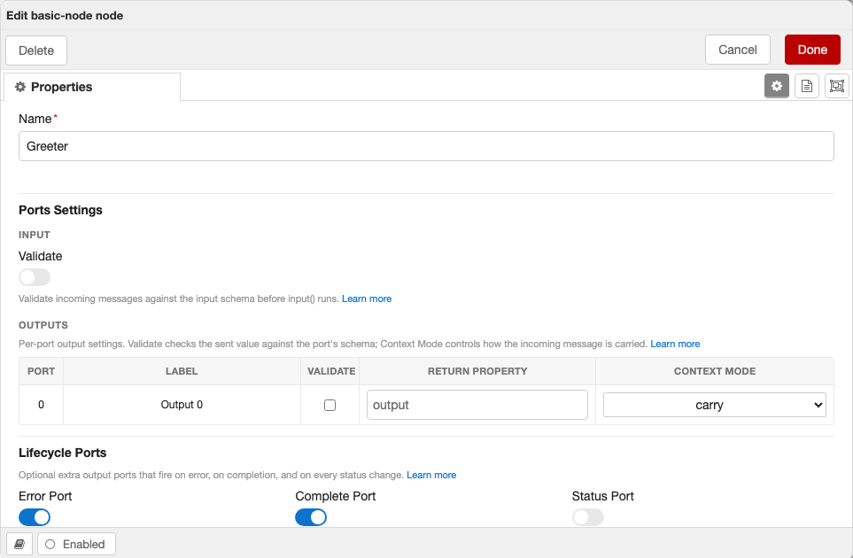
- Ports Settings
- Input — a Validate toggle when the node declares an
inputSchema. - Outputs — a per-port table (one row per base output port) with a Validate column plus optional Return Property and Context Mode columns. Validate checks the sent value against that port's schema; Return Property — shown only when the schema declares
outputReturnProperties— sets each port's return key (defaultoutput); Context Mode — shown only when the schema declaresoutputContextModes— picks how each configurable output carries the incoming message (ports without a declared default stay locked tocarry). The table tracks the node's live output count, so dynamic-output nodes grow and shrink the rows automatically (lifecycle ports excluded).
- Input — a Validate toggle when the node declares an
- Lifecycle Ports — Error, Complete, and Status toggles, shown for whichever built-in ports the schema declares.
Each help line links to the relevant docs. Sections only appear when there is something to configure — a node with no input/output schema and no built-in ports shows just its fields.
Register the Node
Export all nodes from src/server/index.ts using defineModule:
import { defineModule } from "@bonsae/nrg/server";
import MyNode from "./nodes/my-node";

export default defineModule({
  nodes: [MyNode],
});
defineModule creates a typed module manifest that NRG uses to register your nodes with Node-RED. Use it instead of exporting a plain object — it provides type checking on the nodes array and will support additional fields (like plugins) in future releases.
Client-Side Files
NRG auto-generates everything needed for the Node-RED editor from your server-side schema. You don't need to write any client-side code for a basic node. The files below are all optional and exist for when you need more control.
Zero client code required
If your node has a configSchema and credentialsSchema, NRG automatically generates a form using <NodeRedJsonSchemaForm>, wires up defaults and credential fields, and registers the node in the editor. You only need client files when you want to customize behavior beyond what the schema provides.
src/client/index.ts — Custom Registration
Use this when you need to control the order nodes are registered, fetch data before registration, or run initialization logic:
import { registerTypes } from "@bonsae/nrg/client";
import myNode from "./nodes/my-node";

// e.g., fetch configuration before registering
const config = await fetch("/api/config").then((r) => r.json());

await registerTypes([myNode]);
Client-Side Type Inference
The client package uses the same TypeBox schemas defined on the server to provide full type safety in form components. Schema types resolve to their editor form representation:
| Schema Type | Server Infer | Client (form) |
|---|---|---|
SchemaType.String() | string | string |
SchemaType.Number() | number | number |
SchemaType.Boolean() | boolean | boolean |
SchemaType.NodeRef(T) | Config node instance (T) | string (node ID) |
SchemaType.TypedInput<T>() | TypedInput<T> (with .resolve()) | { value: string; type: string } |
useFormNode (recommended)
The useFormNode composable gives your form component typed access to the node, schema, and validation errors — no defineProps needed:
<script setup lang="ts">
import { useFormNode } from "@bonsae/nrg/client";
import type { ConfigsSchema, CredentialsSchema } from "../../server/schemas/my-node";

const { node, errors } = useFormNode<typeof ConfigsSchema, typeof CredentialsSchema>();

node.name      // string — typed from ConfigsSchema
node.threshold // number
node.credentials.apiKey // string — typed from CredentialsSchema
node.id        // string — NodeRedNode base property
errors         // Record<string, string> — reactive AJV validation errors
</script>

<template>
  <NodeRedInput v-model="node.name" label="Name" :error="errors['node.name']" />
  <NodeRedInput v-model="node.threshold" label="Threshold" type="number" />
</template>
Both type parameters are optional — omit them to get untyped access:
// Only type config, credentials stays as Record<string, any>
const { node } = useFormNode<typeof ConfigsSchema>();

// No schema typing at all
const { node } = useFormNode();
Infer type utility
For standalone type inference without the form context, use Infer:
import type { Infer } from "@bonsae/nrg/client";
import type { ConfigsSchema } from "../../server/schemas/my-node";

type Config = Infer<typeof ConfigsSchema>;
// { name: string; prefix: string; threshold: number; enabled: boolean }
// NodeRef fields → string, TypedInput fields → { value, type }
src/client/nodes/{type}.ts — Client Node Definition
Use this to set editor-only properties that can't be defined on the server — such as button, onPaletteAdd, onPaletteRemove, onEditResize, custom label functions, or to specify a custom form component:
import { defineNode } from "@bonsae/nrg/client";
import MyNodeForm from "../components/my-node.vue";

export default defineNode({
  type: "my-node",
  button: {
    toggle: "enabled",
    onclick() {
      // toggle node state
    },
    enabled() {
      return true;
    },
  },
  onPaletteAdd() {
    console.log("my-node added to palette");
  },
  onPaletteRemove() {
    console.log("my-node removed from palette");
  },
  form: {
    component: MyNodeForm,
  },
});
src/client/components/{type}.vue — Custom Form Component
Use this to replace the auto-generated JSON schema form with a fully custom Vue 3 component. NRG matches components to node types by filename — a file named my-node.vue replaces the auto-generated form for the node with type: "my-node". This gives you complete control over the editor UI:
<script setup lang="ts">
import { useFormNode } from "@bonsae/nrg/client";
import type { ConfigsSchema, CredentialsSchema } from "../../server/schemas/my-node";

const { node } = useFormNode<typeof ConfigsSchema, typeof CredentialsSchema>();
</script>

<template>
  <NodeRedInput v-model="node.name" label="Name" />
  <NodeRedInput v-model="node.prefix" label="Prefix" />
  <NodeRedInput v-model="node.threshold" label="Threshold" type="number" />
</template>
The useFormNode composable uses the same TypeBox schemas you defined on the server to give you full autocomplete and type safety on node properties. See Client-Side Type Inference for details.
Full example — conditional visibility, icons, and custom validation
This example shows an HTTP request form that conditionally shows/hides fields and validates them based on user selections — things the auto-generated form can't do on its own:
<script setup lang="ts">
import { computed } from "vue";
import { useFormNode } from "@bonsae/nrg/client";
import type { ConfigsSchema, CredentialsSchema } from "../../server/schemas/http-request";

const { node, errors } = useFormNode<typeof ConfigsSchema, typeof CredentialsSchema>();

const methods = [
  { value: "GET", label: "GET" },
  { value: "POST", label: "POST" },
  { value: "PUT", label: "PUT" },
  { value: "PATCH", label: "PATCH" },
  { value: "DELETE", label: "DELETE" },
];

const authTypes = [
  { value: "none", label: "None" },
  { value: "basic", label: "Basic" },
  { value: "bearer", label: "Bearer Token" },
];

const hasBody = computed(() => ["POST", "PUT", "PATCH"].includes(node.method));

const validationErrors = computed(() => {
  const result: Record<string, string> = {};
  if (!node.url) result.url = "URL is required";
  if (hasBody.value && !node.body) {
    result.body = `Body is required for ${node.method} requests`;
  }
  if (node.authType === "basic") {
    if (!node.username) result.username = "Username is required";
    if (!node.password) result.password = "Password is required";
  }
  if (node.authType === "bearer" && !node.token) {
    result.token = "Token is required";
  }
  if (node.retries > 0 && !node.retryDelay) {
    result.retryDelay = "Retry delay is required when retries > 0";
  }
  return result;
});
</script>

<template>
  <div>
    <div class="form-row">
      <NodeRedInput
        v-model="node.name"
        label="Name"
        icon="tag"
        :error="errors['node.name']"
      />
    </div>

    <div class="form-row">
      <NodeRedSelectInput
        v-model="node.method"
        label="Method"
        icon="random"
        :options="methods"
      />
    </div>

    <div class="form-row">
      <NodeRedInput
        v-model="node.url"
        label="URL"
        icon="globe"
        :required="true"
        :error="validationErrors.url"
      />
    </div>

    <!-- Only shown for POST/PUT/PATCH -->
    <div v-if="hasBody" class="form-row">
      <NodeRedEditorInput
        v-model="node.body"
        label="Body"
        icon="code"
        :required="true"
        language="json"
        :error="validationErrors.body"
      />
    </div>

    <div class="form-row">
      <NodeRedSelectInput
        v-model="node.authType"
        label="Auth Type"
        icon="lock"
        :options="authTypes"
      />
    </div>

    <!-- Only shown for basic auth -->
    <div v-if="node.authType === 'basic'" class="form-row">
      <NodeRedInput
        v-model="node.username"
        label="Username"
        icon="user"
        :required="true"
        :error="validationErrors.username"
      />
    </div>

    <div v-if="node.authType === 'basic'" class="form-row">
      <NodeRedInput
        v-model="node.password"
        label="Password"
        icon="key"
        type="password"
        :required="true"
        :error="validationErrors.password"
      />
    </div>

    <!-- Only shown for bearer auth -->
    <div v-if="node.authType === 'bearer'" class="form-row">
      <NodeRedInput
        v-model="node.token"
        label="Token"
        icon="key"
        type="password"
        :required="true"
        :error="validationErrors.token"
      />
    </div>

    <div class="form-row">
      <NodeRedInput
        v-model="node.retries"
        label="Retries"
        icon="repeat"
        type="number"
      />
    </div>

    <!-- Only shown when retries > 0 -->
    <div v-if="node.retries > 0" class="form-row">
      <NodeRedInput
        v-model="node.retryDelay"
        label="Retry Delay (ms)"
        icon="hourglass"
        type="number"
        :required="true"
        :error="validationErrors.retryDelay"
      />
    </div>
  </div>
</template>
This form demonstrates:
- Conditional visibility — body editor only appears for POST/PUT/PATCH, auth fields appear based on auth type, retry delay only shows when retries > 0
- Custom validation — computed
validationErrorswith context-aware messages, evaluated reactively as the user types - Icons and labels — every field uses the
iconprop for Font Awesome icons - Schema + custom errors together —
errorsfrom AJV schema validation viauseFormNode()andvalidationErrorsfrom custom logic can be used side by side
Built-in Form Components
NRG registers these components globally in every form:
| Component | Description |
|---|---|
<NodeRedInputLabel> | Reusable label with optional Font Awesome icon and required indicator |
<NodeRedInput> | Standard text/number input bound to a node property |
<NodeRedTypedInput> | Node-RED TypedInput widget (value + type selector) |
<NodeRedConfigInput> | Dropdown to select a config node |
<NodeRedSelectInput> | Dropdown select input |
<NodeRedEditorInput> | Code editor (ACE/Monaco) input |
<NodeRedToggle> | Toggle switch for boolean fields |
<NodeRedJsonSchemaForm> | Auto-generated form from a JSON schema |
TypedInput Example
<template>
  <NodeRedTypedInput
    v-model="node.target"
    label="Target"
    :types="['msg', 'flow', 'global', 'str', 'num']"
  />
</template>
Config Node Select Example
<template>
  <NodeRedConfigInput
    v-model="node.server"
    label="Server"
    type="remote-server"
    :node="node"
    prop-name="server"
  />
</template>
i18n in Forms
Use the global $i18n helper to access Node-RED's translation system:
<template>
  <NodeRedInput v-model="node.name" :label="$i18n('label.name')" />
</template>
Config Nodes
To create a configuration node (e.g., a server connection), extend ConfigNode:
import { ConfigNode, type Schema } from "@bonsae/nrg/server";
import { ConfigsSchema, type Config } from "../schemas/remote-server";

export default class RemoteServer extends ConfigNode<Config> {
  static readonly type = "remote-server";
  static readonly category = "config";
  static readonly configSchema: Schema = ConfigsSchema;

  async created() {
    // Initialize connection
  }

  async closed() {
    // Cleanup connection
  }
}
Config nodes have category set to "config" and expose:
this.userIds— array of IDs of nodes using this configthis.users— array of node instances using this configthis.getUser(index)— get a specific user node by index
Functional API
As an alternative to extending classes, NRG provides a functional API for defining nodes. Instead of writing a class with static properties, generics, and Infer types, you pass a plain object and get full type inference automatically.
Why use it?
- Less boilerplate — no
static readonlydeclarations, noInfer<typeof Schema>type exports, no generic parameters - Automatic type inference —
this.config,this.credentials,this.settings,msg, andthis.send()are all typed from the schemas you pass in, without explicit type annotations - Same runtime behavior — the functions return a class that extends
IONodeorConfigNode, so everything works exactly the same: validation, proxy, lifecycle hooks, registration
defineIONode
import { defineIONode, defineSchema, SchemaType } from "@bonsae/nrg/server";

const ConfigsSchema = defineSchema(
  {
    url: SchemaType.String({ default: "https://api.example.com" }),
    retries: SchemaType.Number({ default: 3 }),
  },
  { $id: "api-client:configs" },
);

const CredentialsSchema = defineSchema(
  {
    apiKey: SchemaType.String({ default: "", format: "password" }),
  },
  { $id: "api-client:credentials" },
);

const InputSchema = defineSchema(
  {
    payload: SchemaType.Object({
      userId: SchemaType.String(),
    }),
  },
  { $id: "api-client:input" },
);

const OutputSchema = defineSchema(
  {
    result: SchemaType.String(),
    code: SchemaType.Number(),
  },
  { $id: "api-client:output" },
);

export default defineIONode({
  type: "api-client",
  category: "network",
  color: "#ff6633",
  configSchema: ConfigsSchema,
  credentialsSchema: CredentialsSchema,
  inputSchema: InputSchema,
  outputsSchema: OutputSchema,
  validateInput: true,

  async input(msg) {
    // msg.payload.userId is typed as string — no annotations needed
    const { userId } = msg.payload;

    // this.config.url is string, this.config.retries is number
    const url = `${this.config.url}/users/${userId}`;

    // this.credentials?.apiKey is string
    const headers = { Authorization: `Bearer ${this.credentials?.apiKey}` };

    this.send({ result: url, code: 200 });
  },

  created() {
    this.log(`API Client ready: ${this.config.url}`);
  },

  closed(removed) {
    this.log(`Closed (removed: ${removed})`);
  },
});
defineConfigNode
import { defineConfigNode, defineSchema, SchemaType } from "@bonsae/nrg/server";

const ConfigsSchema = defineSchema(
  {
    host: SchemaType.String({ default: "localhost" }),
    port: SchemaType.Number({ default: 1883 }),
    useTls: SchemaType.Boolean({ default: false }),
  },
  { $id: "my-broker:configs" },
);

const CredentialsSchema = defineSchema(
  {
    username: SchemaType.Optional(SchemaType.String({ default: "" })),
    password: SchemaType.Optional(
      SchemaType.String({ default: "", format: "password" }),
    ),
  },
  { $id: "my-broker:credentials" },
);

export default defineConfigNode({
  type: "my-broker",
  configSchema: ConfigsSchema,
  credentialsSchema: CredentialsSchema,

  created() {
    // this.config.host, port, useTls are all typed
    this.log(`Broker: ${this.config.host}:${this.config.port}`);
  },

  closed() {
    this.log("Disconnected");
  },
});
Config nodes created with defineConfigNode automatically have category set to "config" and expose this.userIds, this.users, and this.getUser().
Using NodeRef with defineIONode
Nodes created with defineIONode and defineConfigNode work with NodeRef the same way as class-based nodes. The referenced config node is fully typed:
import { defineIONode, defineSchema, SchemaType } from "@bonsae/nrg/server";
import MyBroker from "./my-broker";

const ConfigsSchema = defineSchema(
  {
    broker: SchemaType.NodeRef(MyBroker),
    topic: SchemaType.String({ default: "test/topic" }),
  },
  { $id: "my-subscriber:configs" },
);

export default defineIONode({
  type: "my-subscriber",
  category: "network",
  color: "#d8bfd8",
  configSchema: ConfigsSchema,
  outputsSchema: SchemaType.Object({}),

  created() {
    const broker = this.config.broker;
    if (broker) {
      // broker.config.host, broker.config.port are typed
      this.log(`Subscribing via ${broker.config.host}:${broker.config.port}`);
    }
  },
});
Per-port output typing
For nodes with multiple outputs, you have two options for type-safe per-port messaging:
Named ports (recommended) — use a record-based outputsSchema for sendToPort() with autocomplete and per-port types:
const SuccessSchema = defineSchema(
  { payload: SchemaType.Object({ ok: SchemaType.Literal(true), id: SchemaType.String() }) },
  { $id: "router:success" },
);

const FailedSchema = defineSchema(
  { payload: SchemaType.Object({ ok: SchemaType.Literal(false), reason: SchemaType.String() }) },
  { $id: "router:failed" },
);

export default defineIONode({
  type: "router",
  inputSchema: SchemaType.Object({}),
  outputsSchema: { success: SuccessSchema, failed: FailedSchema },
  validateOutput: true,

  async input(msg) {
    try {
      const id = await process(msg);
      this.sendToPort("success", { ok: true, id });
    } catch (err) {
      this.sendToPort("failed", { ok: false, reason: String(err) });
    }
  },
});
Array with as const — use an indexed array for tuple typing on this.send():
export default defineIONode({
  type: "router",
  inputSchema: SchemaType.Object({}),
  outputsSchema: [SuccessSchema, FailedSchema] as const,
  validateOutput: true,

  async input(msg) {
    try {
      const id = await process(msg);
      // Tuple typing: [successPort, failedPort]
      this.send([{ ok: true, id }, null]);
    } catch (err) {
      this.send([null, { ok: false, reason: String(err) }]);
    }
  },
});
Arrow functions
Don't use arrow functions for input, created, or closed handlers. Arrow functions don't bind this, so this.config, this.send(), etc. would be undefined at runtime. TypeScript won't catch this — it's the same constraint as Vue's Options API.
// BAD — this is undefined at runtime
input: async (msg) => {
  this.send(msg); // TypeError
}

// GOOD — regular function, this is the node instance
async input(msg) {
  this.send(msg);
}
Class vs functional: which to use?
Class (extends IONode) | Functional (defineIONode) | |
|---|---|---|
| Type inference | Manual — Infer<typeof Schema>, generic parameters | Automatic — inferred from schema props |
| Boilerplate | More — static properties, type exports | Less — plain object |
| Custom methods | Yes — add methods to the class | No — only lifecycle hooks |
| Inheritance | Yes — extend other node classes | No — fixed base class |
| Mixins/decorators | Yes | No |
Both approaches produce the same runtime behavior. Choose based on your needs — the functional API trades flexibility for less boilerplate, while classes give you full control over the node's structure.